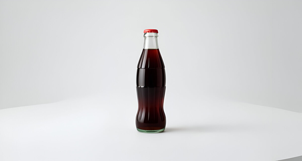
From a humble soda fountain in Atlanta to a symbol recognized in every corner of the world, the Coca-Cola bottle stands as one of the greatest achievements in industrial design. More than a container, it’s a story carved in glass, a meeting point between history, emotion, and ingenuity. For over a century, the silhouette of this bottle has remained remarkably consistent, outlasting trends and technologies.
The Coca-Cola bottle design represents not just packaging but identity itself. It has shaped the way brands communicate through form and emotion. To understand why this design is time-proof, we must trace its evolution from its birth in 1915 to its influence on the future of sustainable and emotional design.
Coca-Cola Bottle Origins: The Need for Distinction
The Coca-Cola story begins in 1886, when John Pemberton, an Atlanta pharmacist, created a syrup that would later become the world’s most famous soft drink. In its earliest years, Coca-Cola was sold at soda fountains and served in glasses, no bottle, no signature packaging. The product’s value was built on taste and experience.
As demand grew, the company allowed independent bottlers to distribute the beverage. By the turn of the 20th century, Coca-Cola was being sold in glass bottles, but with no standardized design. The lack of a distinctive form opened the door for imitators. Dozens of competitors emerged with names and bottles that mimicked Coca-Cola, creating chaos in the marketplace.
People often bought the wrong drink by mistake. The Coca-Cola Company realized it needed something more powerful than a logo or label, a shape that embodied the brand itself.
So, in 1915, Coca-Cola challenged glass manufacturers across the United States to create a bottle that would be instantly recognizable, even if you felt it in the dark or saw it shattered on the ground. It was a radical idea: to make the bottle itself an icon, not just a container.
This was the moment industrial design met emotional storytelling.
The Design Process: From Cocoa Pod to Contour
Among the competitors, the Root Glass Company of Terre Haute, Indiana, approached the brief not as a technical challenge but as a creative opportunity. Led by Earl R. Dean, the design team began researching organic forms to inspire the new Coca-Cola bottle.
In a local library, Dean came across a picture of a cocoa pod, whose rounded shape and vertical grooves sparked an idea. The resemblance between the words “Coca” and “cocoa” led him to explore the pod’s geometry. The pod’s curving middle and ribbed surface were translated into a new glass form, elegant, ergonomic, and unmistakably unique.
Dean sketched the design, refined the proportions to ensure balance, and created molds for testing. The resulting prototype was revolutionary: a curvaceous bottle with deep ribs and a narrow waist that felt both functional and organic.
The Coca-Cola Company approved the design in 1916, and mass production began soon after. The greenish tint of the glass, later known as Georgia Green, gave it a signature color derived from natural sand used in the manufacturing process.
From that point on, the Coca-Cola contour bottle was more than packaging, it was a visual and tactile experience. The company didn’t just sell a beverage anymore, it sold a feeling contained within a form.
Concept and Design Philosophy: When Form Becomes Meaning
The brilliance of the Coca-Cola bottle design lies in how seamlessly it connects form, function, and brand meaning. It was a design that spoke both to the hand and the heart.
Tactile Identity
The ribbed surface gives the bottle its grip and tactile character. Even when wet with condensation, it feels natural and secure in the hand. This sensory connection reinforces memory, consumers can recognize it with their eyes closed.
Visual Memory
Its silhouette became its strongest feature. The bottle’s waistline, shoulders, and rounded base create an instantly recognizable shape that needs no label. It’s one of the few packages that can be identified purely by outline.
Function and Strength
The ribs were not just decorative. They added structural integrity, reducing breakage during shipping and cooling. The form was also ergonomically balanced, distributing pressure evenly across the glass.
Emotional and Symbolic Power
The curves of the Coca-Cola bottle carry emotional warmth. The form is often compared to the human body, dynamic, soft, familiar. Over the years, people have described it as “feminine,” graceful, and full of life. This subtle anthropomorphic quality gave the product character and emotional presence.
Fusion of Nature and Industry
The design drew inspiration from nature (the cocoa pod) yet belonged fully to the industrial age. It embodied the early 20th-century belief that technology and artistry could coexist, a belief that still defines timeless design today.
Coca-Cola Bottle Evolution Through Time: Refinement Without Reinvention
What makes the Coca-Cola bottle truly remarkable is that it has evolved continuously while remaining visually constant. Every adaptation has respected the original design principles while responding to new technologies and consumer habits.
1920s–1940s: Establishing an Icon
By the 1920s, the contour bottle was universally recognized. Its unique form was trademarked across markets. In advertising, Coca-Cola began to use the bottle’s silhouette even in illustrations consumers could identify the brand from the shape alone.
During the 1940s, Coca-Cola became a companion to soldiers in World War II. The bottle traveled the world, turning into a symbol of home, comfort, and American optimism. Its design wasn’t just a marketing tool, it became part of cultural memory.
1950s–1970s: Adaptation and Expansion
As Coca-Cola grew globally, production techniques evolved. Raymond Loewy, the legendary industrial designer, worked with the company to adapt the bottle for larger sizes while maintaining proportion and balance.
Embossed logos gave way to printed ones, improving legibility and allowing for faster manufacturing. Yet the essence of the contour remained. Whether on a 6.5-ounce glass bottle or a 2-liter plastic version, the identity stayed intact.
1980s–2000s: Material Transformation
With the introduction of PET plastic and aluminum, the bottle entered a new era. Engineers ensured that even in these modern materials, the characteristic curves and waistline remained recognizable. The shape was translated perfectly across mediums, a triumph of design consistency.
During these decades, Coca-Cola also embraced design collaborations and limited editions that highlighted the contour as a collectible art form. Artists like Andy Warhol, Robert Rauschenberg, and Salvador Dalí used the bottle as a metaphor for modern culture, elevating it to the status of a pop art icon.
2010s–Today: Sustainability and Legacy
In recent years, Coca-Cola has reintroduced returnable glass bottles, emphasizing sustainability. New materials like plant-based plastics and 100% recycled PET continue to reinterpret the classic form without losing its authenticity.
The bottle’s silhouette still dominates Coca-Cola’s visual identity in advertising, digital campaigns, and even in virtual spaces. The contour has transcended its physical role to become a symbol of connection and joy across generations.
Why the Coca-Cola Bottle Design Is Time-Proof
The Coca-Cola bottle is a rare example of a design that resists aging. While most packaging is redesigned every few years, this one has endured for over a century. The reasons for its timelessness are deeply tied to both design theory and human psychology.
- Authenticity and Origin
It was born from necessity, not trend. Its originality came from solving a real problem, standing out in a crowded market, with creativity and courage. - Simplicity with Depth
The form is visually simple but full of meaning. Its symmetry, proportion, and curves invite the eye to linger, making it pleasant and familiar. - Function Meets Emotion
The bottle doesn’t just contain a product; it creates an experience. It feels right in the hand, and its sound when opened has become part of Coca-Cola’s emotional identity. - Adaptable DNA
The contour design scales across sizes, materials, and technologies without losing recognition, a crucial trait for longevity. - Cultural Resonance
Few designs have integrated so deeply into global culture. From Hollywood films to everyday memories, the Coca-Cola bottle represents togetherness, nostalgia, and happiness. - Consistency and Renewal
The company has innovated within boundaries, ensuring every evolution enhances, rather than replaces, its heritage.
This combination of emotional design, ergonomic intelligence, and brand storytelling makes the Coca-Cola bottle a benchmark of timeless design.
Looking Ahead: The Future of an Icon
The Coca-Cola bottle continues to evolve in a world where sustainability, digital experience, and cultural relevance drive design innovation. Yet the secret to its future lies in maintaining its human touch.
Here’s how the contour design will remain relevant in the years to come:
- Sustainable Reinvention: The silhouette will transition into eco-friendly materials from recycled glass to biodegradable plastics, ensuring environmental responsibility without sacrificing identity.
- Refill and Return Models: As refillable systems become global standards, the contour form will symbolize trust and continuity in a world striving for circularity.
- Digital Identity: In augmented and virtual reality, the contour can act as a digital anchor, connecting physical packaging to interactive storytelling experiences.
- Minimal Branding: As visual clutter fades in modern design, the bottle’s pure form will communicate brand recognition without heavy labeling or graphics.
- Global Adaptation: Across different cultures and markets, the contour will continue to unite diverse audiences with one familiar gesture, the curve of comfort.
Even 100 years from now, the Coca-Cola bottle is likely to retain its magic. Because what people love about it is not just the drink inside, but the feeling of holding something beautifully familiar.
Legacy of a Design Masterpiece
The story of the Coca-Cola bottle is more than a chronicle of glassmaking or marketing success. It is a celebration of what happens when design, history, and emotion converge.
From its origin in 1915 to its place in 21st-century sustainability, the Coca-Cola bottle represents a continuous thread of innovation and cultural resonance. Its impact goes far beyond beverage packaging, it shaped how the world understands brand identity through design.
Every curve tells a story: of invention, recognition, and connection. Designers across industries study it as a symbol of purity in form and clarity in purpose. It proves that when design reflects both function and feeling, it transcends time.
The Coca-Cola bottle is not merely an object, it’s a cultural heirloom. A bridge between the past and the future. And as long as people crave authenticity, simplicity, and human touch in design, that familiar contour will continue to refresh not only the world’s thirst but also its imagination.