
Massimo Vignelli’s 1972 Subway Map for the New York City Transit Authority stands as one of the most iconic examples of modernist design. Celebrated for its clarity, elegance, and innovation, the Vignelli Subway Map map has inspired countless designers and remains a benchmark of timeless design. This article explores the origins of the map, its key design principles, and why it continues to captivate designers and commuters alike.
The Origins of Vignelli Subway Map
In the early 1970s, the New York City subway system was chaotic in both physical and visual terms. Navigating the labyrinthine system of lines and stations was a daunting task, with maps that were often cluttered, inconsistent, and difficult to read. The Metropolitan Transportation Authority (MTA) sought a solution, turning to the Italian designer Massimo Vignelli and his firm, Unimark International.
Vignelli, a staunch advocate of modernism, approached the project with the goal of creating a functional yet aesthetically pleasing map. The result, released in 1972, was a departure from traditional geographic maps. Instead, Vignelli’s design prioritized clarity and abstraction, presenting the subway as a logical and accessible system.
Key Concepts and Design Approach
1. Simplicity Through Abstraction
The Vignelli map is not a literal representation of the city’s geography. Instead, it employs a diagrammatic approach, where stations and lines are organized on a grid-like system of 45- and 90-degree angles. This abstraction simplifies the visual complexity, making the map easier to understand at a glance.
2. Color Coding
Each subway line was assigned a distinct, vibrant color, a concept that has become a standard in transit maps worldwide. The color coding helps users quickly identify routes and navigate the system with ease.
3. Typography and Grids
Vignelli’s typographic mastery is evident in his choice of Helvetica, a clean and legible sans-serif font. Combined with a meticulously crafted grid system, the map achieves a sense of order and precision that is both functional and visually harmonious.
4. Focus on Usability
The map eliminates unnecessary details, such as the exact scale or realistic river boundaries, to emphasize what truly matters: how to get from point A to point B. This commitment to user-centric design set a new standard for transit maps globally.
The original 1972 Vignelli Unimark Subway “pocket map”:

A Controversial Reception
While praised by designers, the map initially faced criticism from the public. Many New Yorkers were frustrated by its lack of geographic accuracy, particularly the distortion of Manhattan’s proportions and the omission of streets and landmarks. In 1979, the MTA replaced the Vignelli map with a more geographically accurate version.
However, over time, Vignelli’s map gained recognition as a masterpiece of information design, and in 2008, the MTA reintroduced an updated digital version for limited use.
Why the Vignelli Map is Timeless
1. Functional Design Principles
The map adheres to the principles of modernism: form follows function, simplicity, and clarity. These values transcend trends, ensuring the design remains relevant.
2. Influence on Global Transit Design
Many modern transit maps, including those in London, Tokyo, and Berlin, echo Vignelli’s emphasis on abstraction, color coding, and grid systems. This global influence underscores the enduring relevance of his approach.
3. Adaptability in the Digital Age
The Vignelli map’s clean lines and bold typography make it ideal for adaptation to digital platforms. Apps and screens benefit from its minimalist aesthetic, which translates seamlessly to small or large displays.
Similar or related Vignelli Subway Map Examples
The London Underground Map
Designed by Harry Beck in 1933, the London Underground map shares Vignelli’s diagrammatic approach. Both maps prioritize clarity over geographic accuracy, making them models of timeless design.
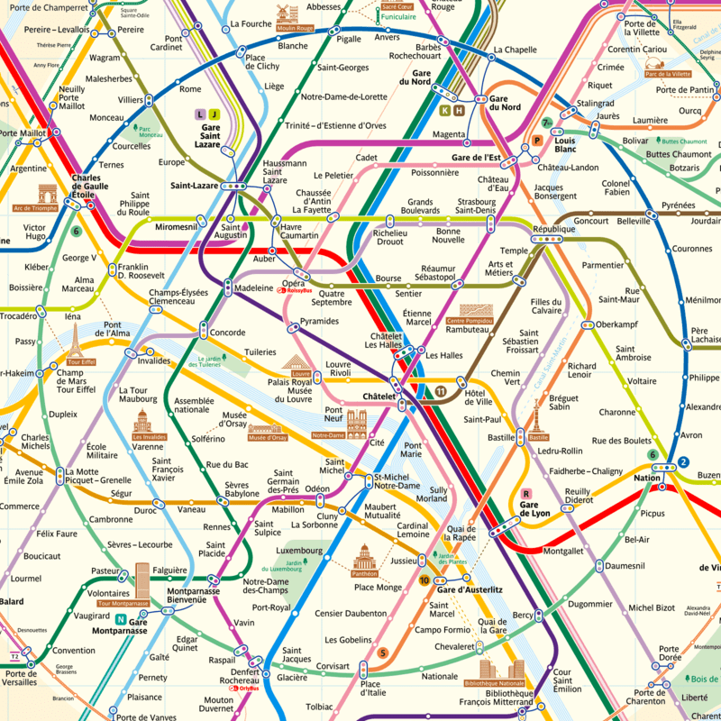
The Paris Metro Map
Paris adopted a similar design ethos, blending functionality with elegant typography and color schemes.
The Digital Vignelli Map
In 2011, the MTA introduced a digital version of Vignelli’s map as part of the Weekender app, demonstrating its ongoing relevance in a tech-driven world.
Subway Maps gallery:


Looking Ahead: Why the Vignelli Map Will Endure
The Vignelli Subway Map remains a symbol of how thoughtful design can solve complex problems. Its emphasis on functionality, clarity, and user experience ensures that it will continue to inspire future generations. As cities grow and transit systems evolve, the principles underpinning Vignelli’s design, simplicity, abstraction, and usability, will remain vital.
Legacy of a Design Masterpiece
Massimo Vignelli’s Subway Map is more than a tool for navigating New York City; it is a masterclass in design that exemplifies the power of minimalism and modernism. By prioritizing clarity and embracing abstraction, Vignelli created a map that transcends its era. Whether in print, on screens, or as inspiration for future innovations, this iconic design will continue to guide and inspire for decades to come.
If you’re a designer, urban planner, or simply a lover of timeless design, the Vignelli Subway Map is a representation of the enduring impact of great design.